

Living room colour palettes 2026 are moving firmly away from the all-white default that dominated the last decade. For most of the 2010s and into the early 2020s, white was the safe canvas of aspirational interior design, clean, photographable, infinitely scroll-friendly. But in 2026, it has a problem. It looks exactly like every other all-white living room that came before it. And more critically, it does not feel like anything.
Interior designers are consistent on this point. Cool-toned grays and whites are no longer factored into 2026 colour trends. White-on-white schemes are starting to feel less relevant – while classic in theory, they can read a bit stark without the nuance and layering that make a space feel truly collected.
The good news is that what is replacing white is not chaotic or difficult. The 2026 palette shift is not about going bold for the sake of it. It is about going warm, layered, and specific – rooms that feel like somewhere rather than a blank canvas waiting to become something.
Here are the five living room colour palettes that designers and homeowners are actually choosing in 2026, with exact paint picks, pairing rules, and real styling guidance for each.
Table of Contents
- Why Living Room Colour Palettes in 2026 Are Moving Away From White
- Palette 1: Warm Terracotta and Clay
- Palette 2: Earthy Green – From Sage to Smoked Olive
- Palette 3: Moody Chocolate Brown and Caramel
- Palette 4: Dusty Blue and Soft Teal
- Palette 5: Warm Plum, Mauve and Merlot
- How to Transition Away From White Without a Full Repaint
- What Colours Are Going Out in 2026
- How to Choose the Right Living Room Colour Palette for Your Natural Light in 2026
- Final Thoughts
Why Living Room Colour Palettes in 2026 Are Moving Away From White
The shift away from all-white is not sudden – it has been building for a few years. But in 2026, it has become a consensus among designers, paint brands, and trend forecasters alike.
Our relationship with our homes has shifted, and people are increasingly drawn to spaces that feel warm, welcoming and nurturing, rather than minimal to the point of feeling impersonal. There is a definite move towards warmer, more embracing palettes.
The underlying reason is cultural as much as aesthetic. After years of prioritising how rooms look in photographs over how they feel to live in, the reaction has been strong. Earthy colours bring quiet warmth and saturation without dominating a living room. The new direction embraces quietly colourful tones – subtle, comforting hues that feel fresh yet timeless. Neutrals with pink and red undertones are becoming increasingly popular, bringing warmth and depth to living spaces.
This is not a swing to maximalism or to rooms that exhaust the eye. It is a much more considered shift – from flat to layered, from cool to warm, from open to cocooning. The palettes replacing white in 2026 all share one thing: they make a room feel like somewhere specific rather than anywhere in general.
Warm Terracotta and Clay
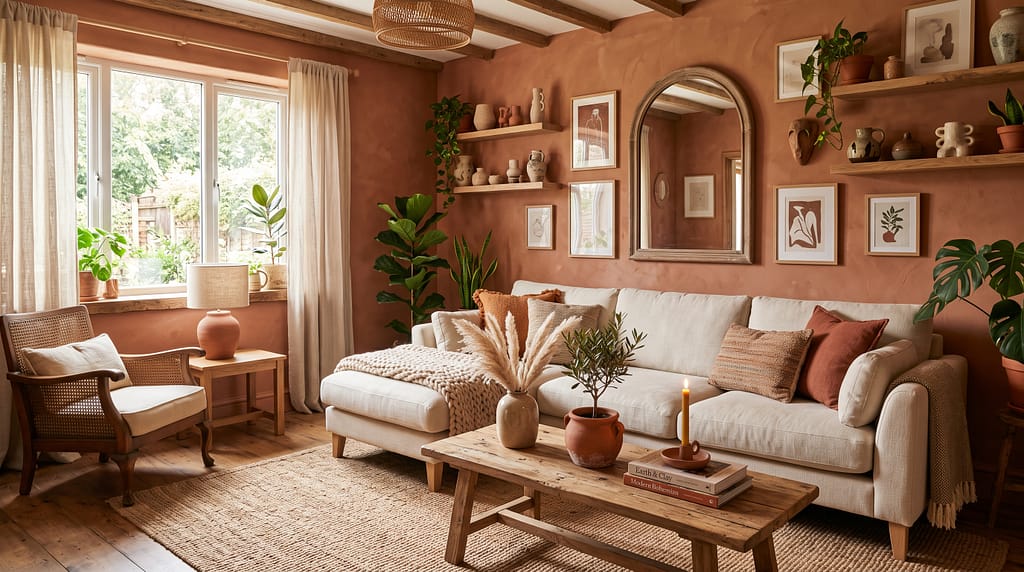
Terracotta has been circling the trend conversation for several years. In 2026, it has fully landed. This is not the bright, saturated terracotta of Mediterranean kitchens – it is a softer, more complex version that sits closer to fired clay or warm sand, with a dusty quality that reads as both contemporary and grounded.
Clients are gravitating toward nature-inspired warm neutrals – think wheat, caramel, terracotta, and warm grays with taupe and greige undertones. These are colours that feel cocooning and grounded. We are also seeing pops of burnt umber, clay and dusty sage as accents. These earthy palettes create depth without overwhelming, and they pair beautifully with natural wood tones and organic textures.
The palette breakdown:
- Primary wall colour: A dusty terracotta or fired clay – think Farrow and Ball’s Tempranillo or Sulking Room Pink (which reads more warm clay in context than its name suggests), or Benjamin Moore’s Terracotta Tile
- Secondary tone: Warm cream or oatmeal on woodwork and ceilings – this keeps the terracotta from feeling heavy
- Accent colours: Dusty sage green, warm ochre, and deep burnt sienna as cushion and textile tones
- Metals: Brass and copper – both amplify the warmth of terracotta rather than fighting it
Furniture pairings: A cream or warm linen sofa sits beautifully against terracotta walls – the contrast is warm rather than stark. Natural wood (oak, walnut) in coffee tables, shelving, and frames keeps the material language consistent. For more on sofa colour choices that work with this palette, see our velvet sofa colours guide – burnt orange and deep plum velvet both work powerfully against terracotta backgrounds.
Who this palette suits: Anyone who finds all-white too cold but finds deep jewel tones too committed. Terracotta is the warmest entry point into the 2026 colour direction – approachable, flattering in natural and artificial light, and endlessly layerable.
Paint picks:
- Farrow and Ball: Tempranillo, Red Earth
- Benjamin Moore: Terracotta Tile, Tuscan Sun
- Dulux: Fired Earth, Warm Terracotta
Earthy Green – From Sage to Smoked Olive
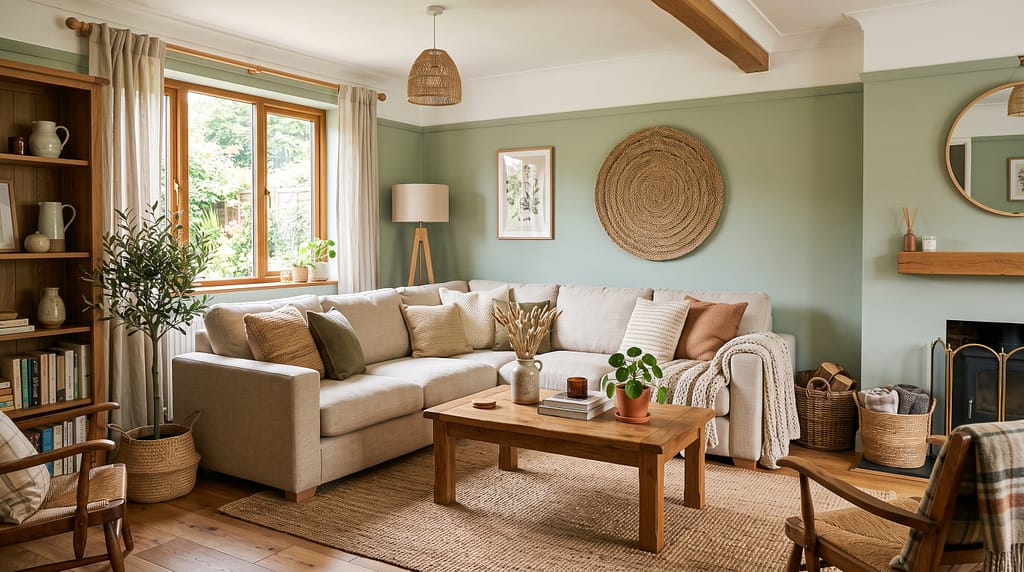
Green is the most versatile of the 2026 living room colour directions because it spans such a wide range of moods depending on the specific shade chosen. At the lighter, cooler end, sage reads as calm and Scandi-adjacent. Moving into smoked olive or mossy green, the same colour family becomes dramatically richer and more complex. At the deepest end – forest green, bottle green, hunter green – it becomes genuinely moody and atmospheric.
Clients are moving toward an expanded exploration of greens in 2026 – everything from smoky olives to rich moss and soft celadon. Designers continue to gravitate toward colours that feel both grounding and alive.
The reason green works so well as a replacement for white is that it offers a similar sense of calm and space at the lighter end of the spectrum, while allowing significantly more personality and warmth. A sage green room does not feel dark or heavy – it feels like a room with something to say.
The palette breakdown:
- Sage and celadon: Pale, blue-green tones that feel airy and fresh. Best in rooms with good natural light – south or west-facing spaces
- Smoked olive: Warm, yellowish-green with a dusty quality. The most versatile shade in the green family – works in both bright and lower-light rooms
- Mossy green: Rich, earthy, unmistakably grounded. Best used as an accent wall or in a smaller room where the depth reads as intimate rather than heavy
- Forest and bottle green: The deepest and most dramatic option. Works beautifully on a single feature wall behind a sofa or in a colour-drenched dining room
What to pair with green walls:
- Natural wood in warm tones – oak and walnut both bring out the warmth in green rather than fighting the cool undertone
- Cream, oatmeal and warm white for large upholstered pieces – a cream sofa against sage green walls is one of the most reliably beautiful combinations in 2026 interiors
- Brass and warm gold metallics throughout
- Terracotta, rust and warm ochre as accent colours in cushions and textiles – the contrast between green and warm earthy tones is one of the most grounded and satisfying in the palette
Paint picks:
- Farrow and Ball: Mizzle, Cooking Apple Green, Calke Green
- Benjamin Moore: Saybrook Sage, Ashwood Moss
- Dulux: Salvia, Sage Jewel
The Afrohemian and earthy green palettes overlap significantly – if you are drawn to this colour direction alongside African-inspired textiles and natural materials, our Afrohemian decor guide covers how to layer those elements into a cohesive room.
Moody Chocolate Brown and Caramel
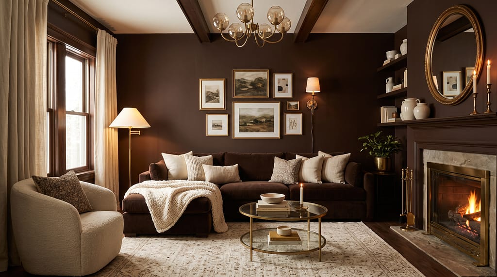
This is the palette most people do not expect to love until they see it in a real room. Deep chocolatey tones offer a rich and versatile option. With subtle charcoal undertones, they can anchor a variety of interiors, creating depth and sophistication. They work beautifully both as a backdrop for colour-drenched spaces or as a contrasting element with lighter textures, balancing elegance with a relaxed, approachable feel.
Brown is having its most significant moment in interior design since the 1970s – and the 2026 version looks nothing like that decade’s version. Modern chocolate brown and espresso palettes are about depth and warmth, not darkness for its own sake. The key difference is in the layering: a 2026 brown living room is built on contrasting tones and textures rather than matched furniture sets in the same shade of brown.
Move away from cold greys and toward rich neutrals – think chocolate brown, camel, smoky greens or warm ochre. These are the shades that are making rooms feel genuinely cocooning rather than merely decorated.
The palette breakdown:
- Primary colour: Deep chocolate brown or espresso on one or two walls – the colour-drenched approach where walls, ceiling, and woodwork share the same tone is particularly effective with this shade
- Secondary tone: Warm caramel, cognac, and amber as furniture and textile tones – these sit within the same warm brown family while providing the tonal contrast the room needs
- Accent colours: Cream and ivory for relief, with dusty sage green or warm rust as accent tones
- Metals: Brass and warm gold – essential. Cool chrome or silver against chocolate brown creates an immediate visual discord
The colour-drenching approach: Painting walls, ceiling, and woodwork in the same deep chocolate brown creates a genuinely immersive, atmospheric room that feels tailored rather than painted. This approach works particularly well in smaller living rooms where the consistent colour wraps the space rather than making it feel confined.
What to pair:
- A cream or oatmeal sofa as the primary seating – the contrast between deep brown walls and pale upholstery is the core of this palette’s visual balance
- Warm wood in medium to dark tones – walnut and dark oak both work, while pale ash or light pine can feel slightly at odds with the depth of the palette
- One or two brass pendant lamps or table lamps – warm light sources amplify the cocooning quality of this palette dramatically
Paint picks:
- Benjamin Moore: Silhouette (Colour of the Year 2026), Black Mocha
- Farrow and Ball: Brinjal, Pelt
- Dulux: Espresso
Dusty Blue and Soft Teal
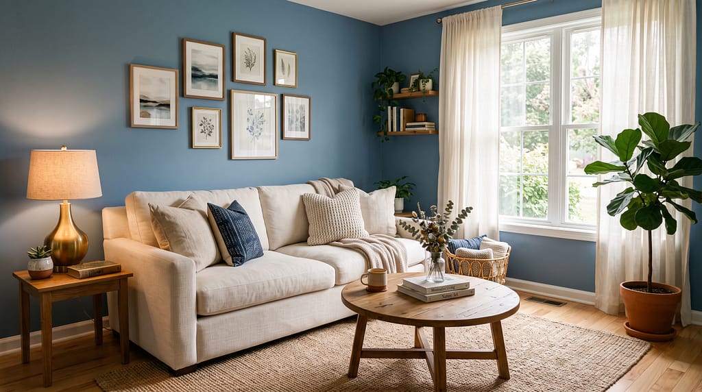
Designers are leaning heavily into soft blues for living rooms in 2026, especially shades that feel calm, airy, and rooted in nature. These colours bring in personality without overwhelming a space and create an instant sense of ease.
Blue is the surprise palette direction that sits slightly against the dominant earthy trend – but the specific version of blue being used in 2026 living rooms is very different from the electric or cornflower blues of earlier decades. The 2026 blue is muted, slightly dusty, and almost always tilted toward either the grey-blue (quieter, more Scandi) or the teal (warmer, more complex, slightly green) direction.
A soft, muted blue makes a great alternative to white and beige. It adds depth and colour while still feeling calm and cohesive with an existing palette. And teal has been getting particular attention – it manages to feel calming and bold at the same time, and feels more current than dark green walls.
The palette breakdown:
- Dusty blue/muted blue: A grey-blue that reads as almost neutral in certain lights and dramatically atmospheric in others. Best in south-facing rooms where the natural light picks up its subtleties
- Soft teal: Blue-green with more warmth and character than pure blue. The more approachable option – works in a wider range of lighting conditions than straight blue
- Deep icy blue: The bolder option – closer to a statement than a neutral, but still far calmer than navy. Works brilliantly as a feature wall behind a sofa
What to pair with dusty blue or teal:
- Warm wood tones – this is essential. Blue without warm wood reads as cold and clinical. Oak, walnut, and warm pine all bring the warmth the palette needs
- Cream and warm white for upholstery and soft furnishings – a cream sofa against a dusty blue wall is one of the cleanest combinations in the palette
- Warm brass metallics throughout – the contrast between cool blue and warm brass is one of the most elegant material pairings in current interior design
- Natural textures – jute rugs, rattan accessories, and linen cushions all warm up a blue room without disrupting the palette’s calm quality
Paint picks:
- Benjamin Moore: Quiet Moments, Van Deusen Blue
- Sherwin-Williams: Sea Salt, Drizzle
- Farrow and Ball: Borrowed Light, Parma Gray
Icy blue is also one of the strongest sofa colour directions for 2026 – for living rooms where the walls stay calm and the sofa makes the colour statement, our velvet sofa colours guide covers exactly how to style an icy blue velvet sofa in a neutral or warm-toned room.
Warm Plum, Mauve and Merlot
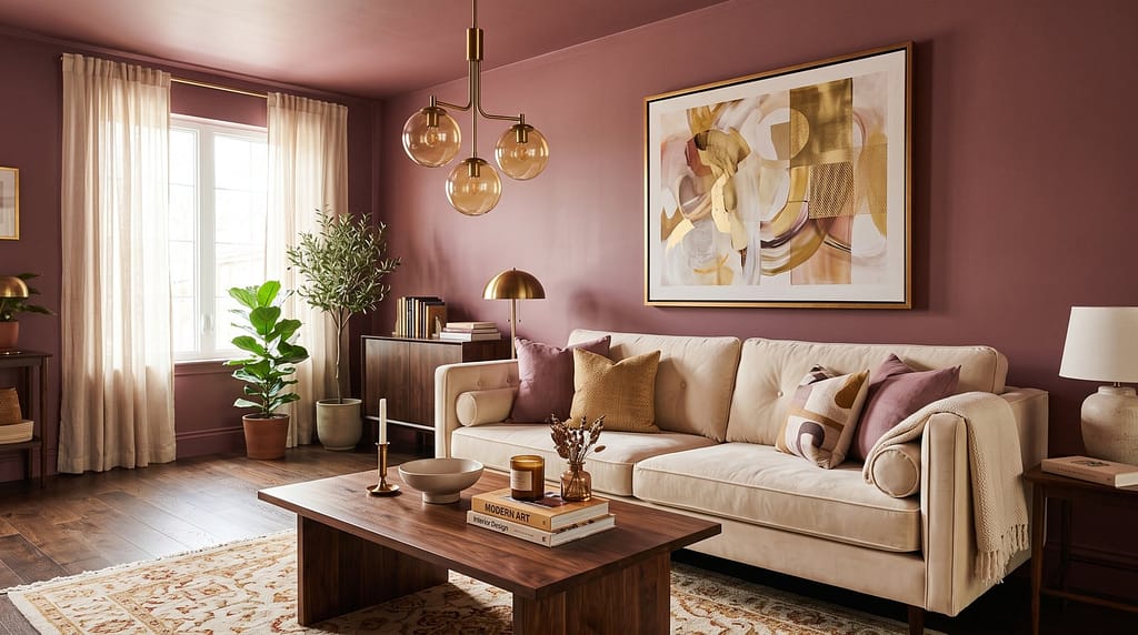
This is the most unexpectedly compelling palette direction of 2026 – a family of warm pink-red-purple tones that sit between classic dusty rose and full burgundy. Merlot reds, oxblood, plum and deep teal layered with warm metals and dark wood tones create dramatic, immersive environments. Mauve tones are also trending strongly – designers using colour-drenched approaches in soft mauve with delicate floral wallpaper on ceilings are producing some of the most distinctive rooms of the year.
The reason this palette works is its warmth and depth. Unlike cool-toned pinks, the warm plum and merlot family reads as sophisticated and genuinely atmospheric. In velvet or richly layered room schemes, these tones produce spaces that feel like an enveloping, comfortable version of glamour – the grown-up alternative to the slightly thin, over-cautious rooms of the quiet luxury era.
The palette breakdown:
- Mauve and dusty rose: The softest entry point – warm pink with a grey undertone that reads as sophisticated rather than sweet. Works beautifully in colour-drenched rooms where walls, ceiling, and woodwork share the same tone
- Warm plum: Deeper and more complex – rich purple with warm red undertones. Best used on a single feature wall or in a smaller room where the depth reads as intimate rather than heavy
- Merlot and oxblood: The deepest and most dramatic option in this family – rich, saturated red-brown that works particularly well paired with dark wood and brass as part of a genuinely luxurious scheme
What to pair:
- Cream, ivory, and warm white as relief tones – these stop the plum or mauve from becoming heavy
- Deep walnut or dark oak wood tones – warm dark wood amplifies the palette’s luxurious quality
- Brass and warm gold metallics throughout – essential, as with every warm palette in 2026
- Velvet upholstery in complementary tones – a cream velvet sofa against plum walls, or a deep teal sofa against merlot walls, are both striking combinations
Paint picks:
- Farrow and Ball: Dead Salmon (mauve), Brassica (plum), Brinjal (deep merlot)
- Benjamin Moore: Victorian Mauve, Vintage Vogue
- Dulux: Dusky Mauve, Warm Plum
For living rooms going in this direction, a curved sofa in a complementary jewel tone or neutral cream is the natural furniture anchor – see our curved sofa styling guide for layout ideas that work with a moody, colour-led room.
How to Transition Away From White Without a Full Repaint
If repainting the entire room feels like too much commitment right now, there are lower-effort ways to start moving the room away from all-white:
Repaint one wall. A single feature wall in any of the five palettes above is the most affordable and reversible first step. Even one wall of warm terracotta behind a sofa transforms the room’s temperature and character.
Go colour-drenched on one element you already paint. Painting built-in shelving or bookcases the same deep tone as an accent wall – and a different colour from the main walls – creates immediate depth and visual interest without committing the whole room.
Swap your textiles first. If repainting feels too permanent, changing cushions, throws, and a rug to a warm earthy palette shifts the room’s temperature significantly before a single tin of paint is opened. Our neutral sofa styling guide covers this exact layering approach for rooms that want warmth without structural change.
Change the light bulbs. Seriously. Switching from cool-white LED bulbs to warm white (2700K) immediately warms every existing surface in the room, including previously cool white walls. It is the single cheapest and fastest change available.
Update one piece of furniture. A single warm-toned velvet cushion, a terracotta ceramic vase, or a jute rug shifts the room’s colour language more than any number of small accessories in the existing white-and-grey palette.
What Colours Are Going Out in 2026
Just as important as the five palettes above is knowing which colours have run their course:
Cool grey and millennial grey – the defining wall colour of 2015-2022 reads as flat and dated in 2026. It is being replaced by warmer, more complex neutrals across the board.
Brilliant white – pure, cool, stark white is giving way to warm whites, off-whites, and Cloud Dancer (Pantone’s 2026 Colour of the Year – a warmer, more aerated off-white) as the safe neutral of choice. The shift is subtle but immediately noticeable.
Bright, highly saturated accent colours – electric teal, sunshine yellow, and vivid orange as accent colours against white rooms reads as early 2020s. The 2026 alternative is muted, earthy versions of the same colours – dusty sage rather than bright green, ochre rather than yellow, burnt terracotta rather than orange.
All-grey furniture schemes – grey sofas, grey walls, grey cushions. The monochromatic grey room is the colour equivalent of white-on-white – it reads as under-decided rather than minimal.
How to choose the right living room colour palette for your natural light in 2026
The single most important factor in choosing a living room colour is not the colour itself but how it behaves in your room’s specific light conditions. The wrong shade of green in a north-facing room can look grey and flat; the same shade in a south-facing room looks rich and alive.
North-facing rooms receive cool, indirect light throughout the day. These rooms benefit most from the warmest palettes – terracotta, chocolate brown, merlot and plum. These warm tones compensate for the cool light quality and stop the room feeling flat. Avoid blues and greys in north-facing rooms without warm material counterbalancing.
South-facing rooms receive warm, direct light for much of the day. These rooms can handle cooler palettes – dusty blue, sage green, and muted teal all look their best in strong natural light. The warmth of the sunlight compensates for any cool undertone in the paint.
East-facing rooms receive warm morning light and cooler afternoon light. A warm neutral like terracotta or caramel works throughout the day; deep moody tones like chocolate brown or plum look their best in the morning and become heavier as the afternoon light cools.
West-facing rooms are the opposite – cool and flat in the morning, warm and glowing in the afternoon. This is the ideal room type for dusty blue or soft teal, which comes alive in the warm afternoon light rather than fighting the cool morning flat.
When in doubt, the universal 2026 guidance is consistent across every design source consulted: lean warm. Whatever shade you are choosing, its warm version will perform better in more rooms and more light conditions than its cool-toned equivalent.
Final Thoughts
The shift away from all-white living rooms in 2026 is not a trend in the short-lived sense. It is a correction – a recalibration toward rooms that feel warmer, more layered, more personal, and more comfortable to actually live in rather than merely to photograph.
Every one of the five palettes above – terracotta, earthy green, moody brown, dusty blue, and warm plum – shares the same underlying logic: depth over flatness, warmth over coolness, character over neutrality. They are all achievable at every budget level, from a single tin of feature wall paint to a full room overhaul.
The best colour for your living room is the one that makes you feel something when you walk into the room rather than nothing. Start there, and everything else follows.
Loved this guide? Pin it to your home decor board and save it for the next time you are choosing a paint colour.
Related posts you might like:
[…] interact with sofa colour, rug choice, and room palette, see our neutral sofa styling guide and our living room colour palettes guide – both cover curtain and window treatment choices as part of the overall styling […]
[…] bedroom colour palette guidance that coordinates with blackout curtains, see our living room and bedroom colour palettes guide – deep charcoal and forest green blackout curtains both work beautifully against the warm […]
[…] What aesthetic are you building toward? Mid-century modern, Japandi, Afrohemian, Neo Deco, farmhouse, maximalist, minimal – each aesthetic has specific stores that serve it well and stores that are essentially useless for it. Knowing your direction first makes every shopping decision faster. For more on the dominant 2026 aesthetic directions, see our living room colour palettes guide. […]
[…] For specific paint colour recommendations at every budget level, see our complete guide to living room colour palettes in 2026. […]
[…] Velvet sofas read best against warm, considered wall colours rather than stark white. The 2026 palette direction – terracotta, chocolate brown, sage green – all work with velvet sofas. For more see our living room colour palettes 2026 guide. […]